Previous HyperStudio Lessons:
Note: This lesson is created for version 3.2 of HyperStudio for Windows. Some features may not be present in the version you may have. You may update your HyperStudio version for free at the HyperStudio Update Library.
Often when making multimedia stacks in HyperStudio we want visible text with an invisible text box. This gives the appearance of text that is part of the background, except that we are able to edit it just as we would edit any other text object. We also want to be able to share backgrounds between cards to save memory. This lesson will show you how to use transparent text objects to your advantage. It will also show you how to handle that memory hog that bloats your stacks.

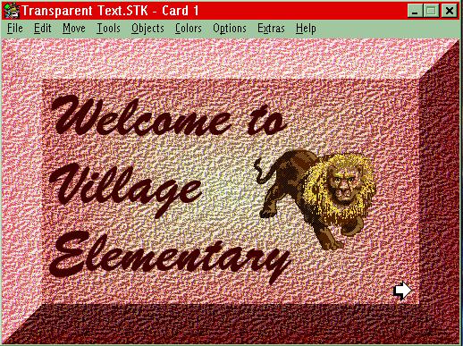
What you see above is a HyperStudio card with a nice, textured background, a button, and a graphic object. The text can be edited by using the Tools Palette in the same way as you would edit text that has a visible box. Using a transparent text object is useful for many reasons:
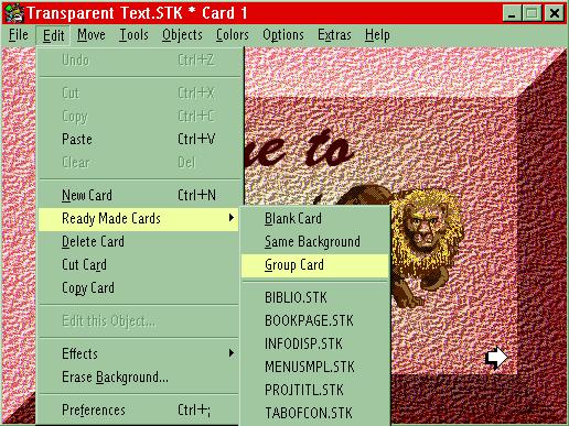
This feature is amazing! Your very next card shares the same background (without the text, button and graphic objects) and it uses no memory for the background!
"Zounds!" you exclaim. "So how is this done?"
Here are the easy-to-follow steps:
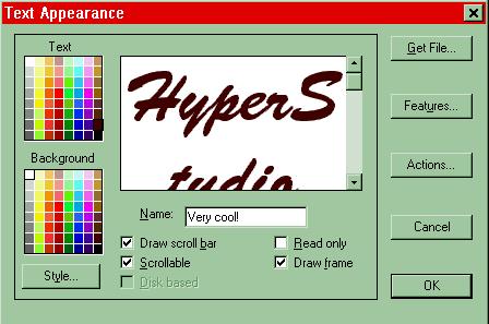
7) Click on "Features" which will only be an option if you have selected "Experienced HyperStudio User" in the Preferences. You can still do it now. Don't panic!
8) After you select "Features" the next window that appears looks like this.
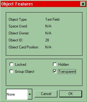
9) Check the box next to "Transparent" and hit OK.
10) You'll be given a stern warning that this option disables a few features like scrolling. Just hit OK. I've noticed also that when you save centered transparent text objects, HyperStudio reverts to left justify. Deal with it!
11) When you get back to the "Text Appearance" window, uncheck the box next to "Draw frame" because a frame kind of defeats the purpose.
12) Now type the text you want
on that card. You can edit the text in the Tools Palette by selecting
the text editing icon ![]() or pressing Control Y.
or pressing Control Y.
13) You're done, unless you want to read the note below! Don't forget, that this is now a Ready-made card that you can group.
Note: When you group a Ready-made card, only the background will be shared because objects aren't shared unless you want them to be. To group an object, follow these simple steps:
Click on the text, button or graphic edit icon in the Tools Palette;
![]()
Double click on the object you want to edit;
Choose "Feature" from the "Appearance" window that opens and check "Group Object" in the "Object Features" window;
Hit OK and your object (text, graphic or button object) is grouped to that Ready-made card. It will show up as using No memory!